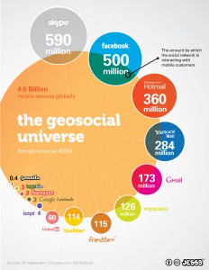
 Data visualization agency JESS3 had one of the best data visualization models of social media. The Conversation Prism made it clear how big the social media world has become. That is, until their new model came out (left) which, for lack of a better word just “rocks”.
If you listen closely, you can hear the sound of thousands of people embedding it into their web sites, presentations, blogs and maybe a tattoo or two.
Check out the big numbers for Skype, Facebook and so on. Take note of the cream-orange area in the center: That represents the 4.6 billion mobile device users on the planet. The overlap indicates how much of the interaction for each network is mobile.
If you’ve read my columns, especially on MediaBullseye, you know I see big growth for mobile. JESS3 just puts it into, well, pictures based on good data.
How long will it be before all of the networks are mostly in the mobile sphere?
Photo: (cc) Jess3 [Source]

