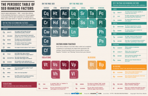
I’ll still parsing its accuracy, but it seems like SearhEngineLand, a long-time credible source for SEO (search engine optimization) information, has produced a great visual explanation of the elements of search engine rankings. Best of all, it’s easy to update as new elements are found. Kudos as well to Column Five who created the infographic.
What do you see in the image that’s right, helpful or incorrect?
No doubt, this will find it’s way into my University of Tennessee Business of Social Media webinar classes!


I am glad that Quality is one of the biggest priorities I have so many people want to do SEO and the biggest mistake they make is using so many items in Red.
For me quality drives many of the other factors. So many other people get confuse with the other factors it can get a bit crazy!